Monday, 27 January 2014

Ideal Reader

The Ideal Reader For My Magazine

My ideal reader is Omar Anthony, a working middle class male who is quite successful at his age, he is 22 years old and lives alone in an apartment at Central London. He rides to work in a Mercedes Benz S Class, and works as a fashion stylist at Calvin Klein, he also gets assigned on various work assignments around the world. He is well in touch with the latest fashion trends and indulges in designer brands from time to time, he has quite a unique taste, and appreciates art. He has an iPhone 5S with various apps installed on them like, Spotify, Music magazine apps, Twitter, Soundcloud, WhatsApp, and Instagram. He's quite a family oriented person, keeps tight communications with his family members and attends Church services with them as often as he can. On a regular morning after his daily workout, he would have an egg omelette with whole bran bread and a fruit shake. During his spare time, he hangs out with his friends, playing basketball, video games, watching TV, staying at home, going to the cinema, or a party.

His types of movies are, Boyz n The Hood, Friday, Fast and Furious, Love and Basketball, Tyler Perry Movies, Die Hard, The Dark Knight, The Best man, and Ride Along. He would attend concerts like that of Jay-Z, Chris Brown, Beyonce, Nas, J Cole, Rihanna, Jhene Aiko, Drake and Kendrick Lamar. He watches BET once in a while, ESPN, SKY SPORTS, MTV, VH1, Comedy Central, and FOX TV, among his favorite TV shows are, Family Guy, Real Husbands of Hollywood, The Game, Martin, NCIS, Fresh Prince of Bel-Air, Breaking Bad, Fashion Police, Monday Night Football, Boondocks, and the NBA Fan Night. He stays up with his friends for music awards like The Grammy's, MTV Video Music Awards, BET Awards, and BET Hip-hop awards. He mainly listens to Hip-hop, Rap, R&B, soul music, a bit of slow jamz, reggae and afrobeat genres on his iPhone 5S, laptop, YouTube, iPod, Spotify, and occasionally on the radio; he listens to ChoiceFM on the radio, BBC Radio 1Xtra online and Power 105.1FM on YouTube or their website. He accesses his music by buying some of them on iTunes legally and downloading others illegally, he buys some music album CDs from time to time, depending on how special they are to him.

I think my magazine would appeal to him as he is the stereotypical cool fashionable guy that dresses well, has a great sense for style and a good eye for art, enjoys company and is in touch with his type of music, therefore, if he saw this magazine and read it, it would appeal to him, as it's similar to other magazines like Elephant, GQ, XXL, Complex, The Source, Rap-Up, Rolling Stone and various other magazines in which he likes.

Thursday, 23 January 2014

MUSIC MAGAZINE PLANNING

MUSIC MAGAZINE PLANNING

I am going to be creating a music magazine (the front cover, contents page and double page spread of the magazine), so I've started planning out how I want the magazine to look by writing down a few ROUGH notes, making sketches and saving & taking pictures of various magazines. I am going to be creating a music magazine for hip-hop and R&B music. While in school today, I came up with eleven titles for the magazine and I took them up to my intended audience so as to find out which one they would prefer, and then I would decide on which title to use, here are the results:

  • TRACE-2
  • FUSE-13
  • CHILLED- 0 
  • LAY-BACK-0
  • FRESH-0
  • DOPE- 4
  • REVIVE- 4
  • SONGZ- 0
  • URBAN-1
  • MY STREETZ- 0
  • STREETZ- 4
After some considerations and comments, i have decided to go back to my intended audience with two main titles and ask them which they prefer, this would be done by Friday:
  • URBAN REVIVE- combined two of my first options together: URBAN & REVIVE
  • FUSE
The results which I get from this survey would then determine the title I would choose for the music magazine.

Here are some image inspirations  for my magazine:


From these images, I was inspired to do a two-mid-shot of two artists/models for the front cover, I further got some inspiration from, Jay-Z and Kanye West as they both have a good tight relationship together and are still in the same music industry. These pictures would also be helping me to decide on my magazine layout and design, and also the types of poses and camera shots I would like, and consider doing.


 WISH ME LUCK! :)


MY MAGAZINE

VIA-FDA

Here's the front cover and contents page for the school magazine I made, it's a magazine for the school VIA-FDA which stands for Virgin Island Art & Fashion Design Academy. 

Tuesday, 21 January 2014

FILM POSTERS

Comparing & Contrasting the Marketing of three teen movies

Clueless Movie Poster
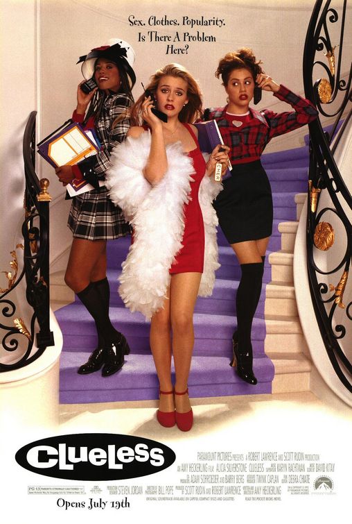
CLUELESS: Is a 1995 American comedy vaguely based on the 1815 novel Emma, by Jane Austen.The main cast were, Alicia Silverstone. Stacey Dash, Brittany Murphy and Paul Rudd. The film is set in Beverly Hills. It's about Cher, a popular girl who occupies her time playing matchmaker,guiding friends with fashion choices, advising the new girl  at school on a makeover, and looking for a boyfriend. 
Teenage representation:  the main characters are the three girls we see on the poster, Cher (placed in the center)- is the leader of the group, good-natured but the superficial type of teenager-popular, spoilt, attractive and wealthy. Cher's best friend (on the left)-Dionne, also rich and beautiful, she's however the caring type, Tai (to the right)-is the newbie; known as the ugly duckling made over into beautiful swan, represented as the awkward/shy teenager who becomes overly confident.
Use of Image & comments on layout and design: the image plays the main part on this poster, you are able to tell it's about three girls, the one in the middle is probably the leader of the bunch and looks like a diva, they all seem to be really stylish and wealthy-dressed in quite luxurious clothing, all have phones, the stairs in which they are standing on looks like that of a really expensive house and the girl in the middle seems to have a car (the car key in her hand), the girl on the left seems nice, this is taken from her facial expressions-she's smiling, while the girl on the right seems a bit more awkward as her hair is quite different from the other two(she doesn't look as stylish as them neither does she seem to care that much about the way she looks). The layout and design looks quite posh and stylish.
Taglines or slogans: A slogan is placed on the top of the poster which reads, "Sex, Clothes, Popularity. I8s There A Problem Here?"- this kind of represents what some teenagers lives are about.
Step Up 2 the Streets Movie Poster
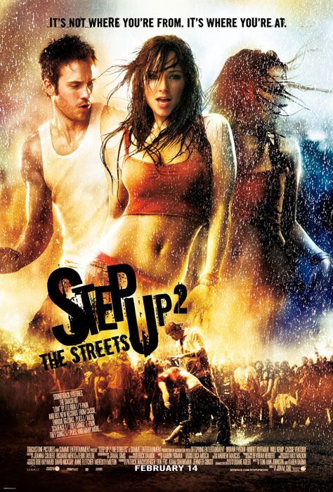
STEP UP 2: The Streets Is the 2008 sequel to the 2006 film Step Up, set in Baltimore, Maryland, at the Maryland School for the Arts. It follows the journey of a rebellious street dancer, Andie as she pursues her big dreams on becoming a street dancer and struggles to fit in at the prestigious school. She shows great promise as a dancer, but she can't seem to let go of her past life for a fresh new start.
Teenage representation:  the teenage characters are represented as, rebels, outsiders, bad behaviour, not doing well academically, working hard on their talents, awkward, stubborn, jealous,envious, become a close-knit if they have have something which connects them together, in this case being dance, pranksters, destructive, physical-the fights, misunderstood, artistic. Unlike Clueless, teenagers here aren't as wealthy, teenagers in Step Up 2 are more of the average teenagers in which we meet everyday, teenagers here are however more destructive, they are more free and have a closer relation with people.
Use of Image & comments on layout and design: the image plays the main part on this poster and represents what the movie is about, the layout has a quite graffiti approach to it, and this matches with the movie being about streetdance, it shows the road & a group of people watching the characters dance, it shows lights, all these items relate to the street dance, we are able to see the main character at the center and her partner by her left and also on the bottom of the page, they both have a good physique which relates to them being fit for street dance. We see rain drops, expressive, bright and bursting colours which all match to the type of movie in which the poster is marketing.The layout and design looks energetic, bold, and loud. The poster design and layout here is more graphical, expressive and artistic than the other two movie posters.
Taglines or slogans: A tagline is placed on the top of the poster which reads, "IT'S NOT WHERE YOU'RE FROM. IT'S WHERE YOU'RE AT."- this represents another side of teenagers lives of being tight-knit.
[ BREAKFAST CLUB POSTER ]
THE BREAKFAST CLUB: Is a 1985 American coming of age/teen comedy drama film, it's written, directed, and produced by the late John Hughes known as the king of teen movies for all his other most successful films of the 1980s and 1990s like, Ferris Bueller's Day Off, Sixteen Candles, Home Alone and Home Alone 2. The movie stars Emilio Estevez, Judd Nelson, Ally Sheedy, Anthony Michael Hall, and Molly Ringwald. The storyline follows five teenagers of different high school groups who spend their Saturday in detention together, they pour their heart out to each other and discover there's more to do with them than their personal stereotypes.
Teenage representation:  teenagers are represented as of bad behaviour; Brian-juvenile, smart/geeky/nerdy, losers, weird; Allison-awkward, solitary, goth, the basketcase Claire-superficial/beauty, popular, miss good girl, rude, bossy, of diva behaviour, the princess Andrew "Andy"-dumb, athletic, emotional; John-rebellious, douchebag, ass, destructive, disrespectful, bit emotional, the criminal. The five main characters were referred to as the "Brat Pack." Teenagers here were just a mix of different stereotypes, way different from that of Clueless, that is except for being awkward & the superficial stereotypes, the teenage representation in this film is more closely related to that of Step Up 2, .
Use of Image & comments on layout and design: the image plays the major part to this poster, as it shows the five main characters looking directly at the audience, these characters are of great importance to the poster's layout and design, and so does their dressing, we are able to tell who the nerd is, the jock, the superficial, the rebel and the reclusive character.The design and layout was made in such a way that the audience are mainly drawn to the characters of the movie.This layout and design is simpler than that of the other movies, but it still however tells a lot about the film, the layout leaves it to the characters dressing and facial expressions to reveal what each of them represent.
Taglines or slogans: A slogan is placed on the top of the poster which reads:
"THEY ONLY MET ONCE, BUT IT CHANGED THEIR LIVES FOREVER. They were five total strangers, with nothing in common, meeting for the first time. A brain, a beauty, a jock, a rebel and a recluse. Before the day was over, they broke the rules. Bared their souls. And touched each other in a way they never dreamed possible."- this represents the five different teenage characters and stereotypes in the movie and vaguely tells us what the film is about.


Sunday, 19 January 2014

pLANNING mAGAZINE

mY mAGAZINE pLANNING

The magazine in which I am going to be creating would be of the cover page and contents page, in total, it would have four high quality varied photographs.

Audience: the magazine is mainly based for the youth, and parents of those who are artistic and want a future in art, those looking for schools, the next move in their career path, trying to save up, that are interested in good education but a nice social life too, the technology generation, creatively unique, might be considered awkward, want their alone time, don't want to be bossed around, might need a little bit of guidance and motivation, like having fun, want to be prepared for a successful future, passionate, with a competitive environment, and a tight-knit school who are interested in every single student's progress.

IDEAL reader: An ideal reader for, my magazine would be the youth age from around 16-21.

TITLE choices-and how the audience voted:
  • Viva School of Art-2
  • Virgo's Art School-1
  • Royals Art Academy-5
  • Virgin Island Art & Fashion Academy-8
  • Art Community School-2
  • Indulgence Art College-3
SLOGAN choices-
  • "Let the creativity flow..."-6
  • "Art has no limits."-10
GOING WITH- Virgin Island Art & Fashion Academy. Slogan-"Art has no limits."

FLATPLAN-
Here's the front cover and contents page layout for the magazine, this layout
 might however  look a bit different when the final product of the magazine is made.

Saturday, 18 January 2014

mAGAZINE aNALYSIS

mAGAZINE aNALYSIS

I am researching on two magazines and analysing their layout, these magazines would be inspiring me on the magazine in which I am going to create.

First Magazine- VOGUE-April, 2012:
Here, the overall font is quite bold and visible, and we can see the home style for this magazine is red, black and white.The head text is a red serif font that matches the mid-shot taken of the model's(Jennifer Lopez) appearance on the front cover-she's wearing a really stylish red dress paired with nice accessories that represent wealth and fashion sense, her make up is done to perfection with a red lipstick.The heading is also quite stylish, this font gives a hint that it's a fashion magazine dealing with style.The title speaks for itself, VOGUE- means what's popular,what's conquering the fashion & style world at a point in time, it's fascination, infatuation, passion, a craze, trend taste, what it meets the fancy, enthusiasm...it goes on!

The model seems to be looking directly at the audience from this shot (she has a direct mode of address).The content on the cover page is clearly visible from the background, it talk's about the model/Jennifer Lopez placed on the cover page, lifestyle,getting your body right, having a great skin, a bit on relationships, and as we expect, fashion!!! This represents the readers of this magazine and what the magazine is all about, Fashion, Lifestyle, Beauty, Fitness, Health and Relationships, so it's a pretty conventional magazine as to other fashionably stylish magazines.

Second Magazine-AR[t]-April, 2012:
This is an art magazine that also has an overall bold and visible font, the home style for this magazine is mainly black and white.The head text is a black, simple, but yet interesting text of sans serif font that also matches the close-up shot taken of the model on the front cover-her appearance seems quite simple but yet artistic and appealing to the eye, there's a use of plain/nude colours on the magazine too, so as to create an overall simple but yet classy magazine.

The title is quite simply said, "ART"- a magazine talking about art! The model seems to have a quite strong and focussed face.The content on the cover page is clearly visible from the background, it talk's about the different things that have been going on in school, new inventions and attractions.The magazines draws audiences that are interested in the school and would like to know more on what they have been working on in the
school.


Thursday, 2 January 2014

The Hobbit 2-EXHIBITION RESEARCH

The Hobbit 2: The Desolation of Smaug

How many 3D IMAX cinemas are there in the UK? = 36
How many are showing 'The Hobbit 2'? = 36
How many screenings are there per day? = There are 3-5 screenings.

:Newspaper Advert
What times are they? = They range from 12:10-15:50-19:30-22:45.
Are there any smaller independent cinemas in London showing the film? =around 30
If so, how many screenings per day? =1-2 screenings

What was the film's budget? = $225 million

How much has it taken at the box office since the opening? = UK-$9.3 million (1st week) US-$31.5 million(2nd week)
                                                             Newspaper review:
IS THIS FILM A FINANCIAL SUCCESS?
The Desolation of Smaug failed to reach the first chapters record, it's two-thirds if the way to matching that goal. The sequel is 15% lower than the first chapter, so it has just around $700 million to catch up to Journey(The first chapter). So I would say The Hobbit 2 is yet to be a financial success.
VARIOUS POSTERS PLACED IN THE CINEMA FOR THE HOBBIT THE DESOLATION OF SMAUG


Wednesday, 1 January 2014

TEENAGE REPRESENTATION-MAGAZINES


VIBE & BLACK HAIR MAGAZINE


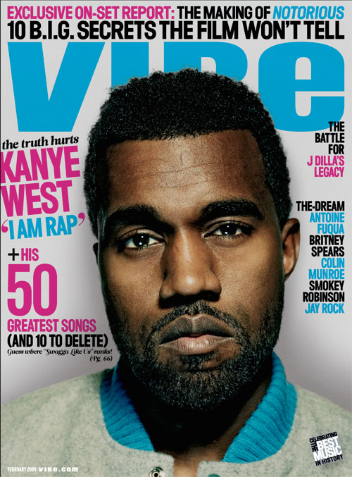
VIBE: In this magazine, the color of the text used was pink & blue so as to represent both gender: the female & male gender respectively. Having Kanye West on the front cover would attract teenagers to the magazine because most teenagers listen to his music. Kanye West's pose would appeal to teenagers especially boys as they could look up to his hairstyle and dress sense, it would also appeal to teenage girls because most teenagers girls get attracted to Kanye West. This magazine could attract teenagers who are known to have the superficial stereotype as the magazine clearly shows a closeup of the artist Kanye who is looking at the audience with a direct mode of address so the teenage audience are able to easily notice the cover. The text is bold & colorful so as to stand out from the cover, teenagers just like all other ages of the society, are more attracted to things that stand out and are colorful/intense. On the whole, the magazine doesn't clearly represent the teenage stereotypical personality but there are certain features to the magazine which draw the teenage audience, like the information in which the magazine contains.
BLACK HAIR: In this magazine, coincidentally, the color of the text used was pink & blue too.The artist, Kelly Rowland, is also looking at the audience with a direct mode of address so as to get the attention of the teenage audience. The magazine efficiently  represents teenagers, to be more specific girls of color. The publisher's have chosen to use a successful female of color on the front cover so as to attract people who admire her to buy the magazine. They have also used other successful female music artistes that have teenagers as fans doing this would attract teenagers to want to buy and read the magazine. they have also used colors that are stereo-typically associated with teenagers such as blue and pink. The magazine also includes titles that would attract teenagers such as "Free" and "Win" because most teenagers want the chance of getting free things. They are also logos of social networks such as facebook and twitter this attracts teenagers because teenagers are stereotyped as digital natives. It also supports the stereotype of teenagers being superficial, as the text reads, "BLACK HAIR" and shows the female gender looking "glammed" up- make up, hair done, dressed well and are attractive, which is what most teenagers/teenage girls look into and get really interested/obsesses on. On the whole, the magazine doesn't clearly represent the teenage stereotypical personality but there are main features of the magazine that draw in the teenage audience.

LESSON-15 NOV 2013-MISFITS

MISFITSMisfits is a British television series on the network Channel 4, it was aired November 12 in 2009 and ended on December 11 2013 with it's 5th season. It's about 5 teenage offenders who acquire strange superpowers during their community service through a lightning storm. Misfits is a science-fiction comedy-drama or teen-drama, this makes the show a hybrid genre.

MISFITS-S01 E02
The characters in this show can be seen as Dumb, Sarcastic, Self-aware, Bitter, Superficial and Juvenile Delinquent, which is how the media portrays most teens and this made to represent how the world thinks of most teenagers.
What makes it a teen drama?-MICRO & MACRO ANALYSIS
CAMERA/MES/EDITING/SOUND: Fast paced camera movement, teenage characters, community service, their dressing, there's a nerdy-weird boy, use of Rocky-Indy soundtrack, fast transitions, modern font-titles, digital natives-Internet & Phones, each of the teenagers have the I don't care look-individuality.
What makes it British?-use of UK slang, accent, Dull color-moody weather/looks wet (could be seen as boring), the UK scenery, ASBO, different locations in England-Regional, the mode of dressing.
CHARACTER REPRESENTATION- Disrespectful to old people, weird, nerdy.
All four teenager personality are covered; Sexual connotations, rude-stereotypes, swearing, violent, relationships, probation, Rocky soundtrack.
Dressing/Costume-Indicates Personality, Religion-the crucifix on the necklace which the black male character is wearing, hoop earring- could be said as stereo-typically represent the ghetto, sexual orientation. 

MY BROTHER THE DEVIL & THE HOBBIT

Comparing & Contrasting:

Is a debut film by a Welsh-Egyptian director Sally El Hosaini, it stars a character named Rashid, who is a young guy from a traditional Arab Family of Egyptian descent. and lives with them in the Homerton council estate. He is a member of a gang that run the streets of Hackney, which is one of London's most ethnically-mixed and historically dangerous neighborhoods. Rashid's younger brother, Mo, he idolizes his charismatic older brother and wishes to follow in his footsteps, but Rashid wants him to have a better life than that of the streets and face his studies. Rashid later on becomes friends with Sayyid who is a successful photographer, and he shows Rashid the world which he never knew of. Just as Rashid decides to get out of the streets, Mo gets in and starts running the streets without Rashid's knowledge. Mo's actions create unforseen consequences that could ruin both brothers' lives.

PG Rating:13-15, Release Date: 22 January 2012 (Sundance Film Festival), 9 November 2012 (UK), March 23 2013 (USA). Was later released in Australia, Germany, New Zealand and Canada.
Running Time: 111 minutes
  • Development- The movie took 6 years to make, the director went back to her documentary root so as to research and develop the script. She immersed herself with the gangs of Brixton, Hackney and Highbury.
  • Pre-Production- The location, which is East London was set, casts & crew are chosen, and sets are made.
  • Production- Point at which shots of the movie is taken.
  • Post-Production-editing and sound effects of the movie are included.
  • Distribution- Information of the movie is spread across the world.
So, just like The Hobbit, My Brother The Devil takes the steps needed to create & distribute a movie, the only difference here is that My Brother The Devil is done a much more smaller scale: Lower Budget, Upcoming cast & crews and a lower distribution rate.

Producers:  Gayle Griffiths, Michael Sackler & Julia Godzinskaya.  Director: Sally El Hosaini.
Scriptwriter: Sally El Hosaini.  Cinematographer: David Raedeker
Editor: Iain Kitching   Composer: Stuart Earl

Cast:
  • Ashley Thomas
  • Said Taghmaoui
  • Aymen Hamdouchi
  • Fady Elsayed
  • Anthony Welsh
  • Arnold Oceng
  • Bashy
  • James Floyd
Budget-  £650,000 and was raised through private investors.

Box-Office:
Opening weekend- $44,833-57 screens
UK Box Office- $87,150
American release- $10,305-in one weekend on 2 screens
Trailer:
Promotion: Have similar promotional method to that of The Hobbit but they are however on a much smaller scale due to a lower budget; adverts/trailers could be seen on TV, YouTube and posters could be seen on some newspapers and magazines. However, both movies are able to promote themselves for free via social media: Facebook, Twitter, tumblr, Blogs and by word of mouth from various fans or through interviews made.